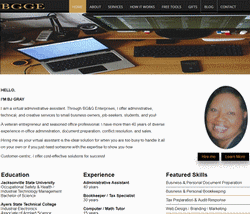
 BGGE has a new look. I've used the "road to success theme" since 2013. I've wanted to change the home page for months. Under the old framework, periodic changes eventually made it look bloated. It definitely had become slow to load.
I'm calling this 2017 revamp "getting to know me". The home page is still informational and service-oriented, but also features my "virtual administrative assistant" qualifications, portfolio, and current promotions. The view-port is wider; the menu and footer links have been reorganized for easier navigation; and the social media buttons have been moved to the top of the page for easier access.
 Completely overhauling BGGE will not be necessary during this revamp. But I will need to manually make changes to certain pages that did not automatically conform to the new template layout. Over the next few weeks, I'll also be checking for broken links, cleaning up code, streamlining the content, and removing or redirecting unnecessary pages. I am changing the focus of gift shop's inventory and hope to have the new categories in place for the Christmas Holiday shopping season.
Early reviewers indicated that they liked BGGE's new clean look. But, what do you think? Like, share, or follow me on your favorite social network, or comment below. Please use the contact form to report any problems you encounter using the site during this transition. I appreciate your feedback.

Add Comment